Our logo has a spiffy new face, along with an expanded visual language.
It’s not a huge change, but we’ve cleaned up a bit, and given our logo a shave and a haircut. Why have we made this change? Our company was built on a bedrock of strong cultural values. Our founder, Daniel Dines, talks about these values every chance he gets. But we had never articulated and memorialized our brand values so that everyone in the company could talk about them in a consistent way. This is becoming critical as we continue our fast growth, adding more people and customers every day. So, we embarked on a project to articulate our brand values and behaviors, our vision, and our purpose.
How did we approach this?
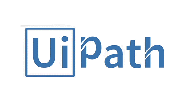
Well, first we humbly acknowledged our visual heritage. The UiPath logo has always been comprised of the “Ui” in a box, followed by “Path.” We have embraced and emphasized the “Ui” part of our name, making it the basic building block for our visual brand DNA. The redesign simplifies the type treatment of our name, while at the same time integrating it more seamlessly with the “Path” part.
We’ve matched the weight of the Ui box lines with the weight of the simple letterforms, creating a cleaner, bolder, and more uniform logo. This helps the logo scale up and scale down in a highly readable way. Our overall design further celebrates “U” and “I”, using these two letters as a stylized abstract design element, nestled into a dot matrix comprised of tiny squares.
Then there’s color.
We’ve moved from blue as our primary logo color to a distinguishing bright orange. Technology companies love blue logos and so do we. But we feel the vibrant, warmer orange is friendlier and better expresses who we are and what our brand stands for.
Our new visual identity combines the primary orange with an updated, brighter blue and a palette of grays, black and white, to present a cleaner, simpler, and more optimistic brand voice.
Our purpose as a company is to accelerate human achievement. UiPath makes software robots to do dull, repetitive tasks so people don’t have to. With hearts and minds freed up to focus on a higher order of work and play, people can set their sights on great things—including making work a joyful experience. With our new logo and visual identity, we will step on the global stage with a presence that confidently reflects our brand values of humility, boldness, immersion, and speed. With our new tag-line we inspire people and companies to act now: UiPath. Reboot Work. More on this later.
![]()
Mary Tetlow is the VP of Global Brand Experience at UiPath.